Nexaas Rebranding

Branding, art direction and motion design

Nexaas is a company of digital solutions for business with a wide range of financial softwares. Their vision is that monolytics ERP sytems are a thing of the past and that micro-services is the new way to go.

In 2018 they were presented with a inevitable shift from targeting small business to medium and big. That shift required a major overhaul at their image, both external and internal, and a bigger chalenge: develop a systematic identity for its fragmented portfolio and communication.

The problem

One of the major problems was the inconsistency of a visual identity not only between products, but also inside the own product.On top of that a parent brand that wasn't communicate well with the corp enviroment and a not so clear statement of their mission and vision.

  • A almost childish parent logo;
  • Weak sub-brands;
  • Illustratios that required too much time;
  • Colors inconsitencies;
  • Change of persona.
We want to be part of this change. Moreover, we aim to be the change, and for that we position ourselves at the forefront of those who open the way and create new niches and opportunities.
The Nexaas manifest
Sketches and iconic studies.

About colors

Color is a major pilar at Nexaas, primarly contexting the message, if its about itself or one of yours products. Secondarly, it sets the tone of a unified experience across its multiple poits of interaction with the brand.

With that in mind, was developed a complete color palette with specifics setted tones and light variation.

Color palettes.

Visual Elements

From the very beginning, the concept of the new identity revolved around fragmentation and optical illusion. That translate into the logos as a isometric cube wich reflects the light in a unique way and the visuals ellements, overlaping and transforming into something else.

Each product is a cube, with a universe thats extends in itself but also connects to other products to expand. The Nexaas logo, as the parent brand, is the only one exception, ofering a macro view of the possiblities throug its inner space and external distortion.

Nexaas symbol.
Estoka cube.
  • The logos are divided into four categories, the Nexaas brand with its exclusive N shaped symbol and typography;
Nexaas logo.
  • The main solutions, each with its own color and styled initials plus its idependent name;
Myfinance logo.
Billimatic logo.
Cobrato logo.
Emites logo.
Estoka logo.
  • The "apps suites", a set of applications directed to especifics markets;
Nexaas Serviços logo.
Nexaas Varejo logo.
  • And the "core apps", a set of underling apps responsable for the operational system. Its always identified by the same "Nexaas Blue" and the prefix "Nexaas" before its name.
Nexaas ID logo.
Nexaas Account logo.
Nexaas Smartbank logo.
Connected cubes.
Nexaas symbol.
Illustration of products cards connected to the Nexaas Varejo cube and a laptop.
A smiling woman.
A three page brochure.
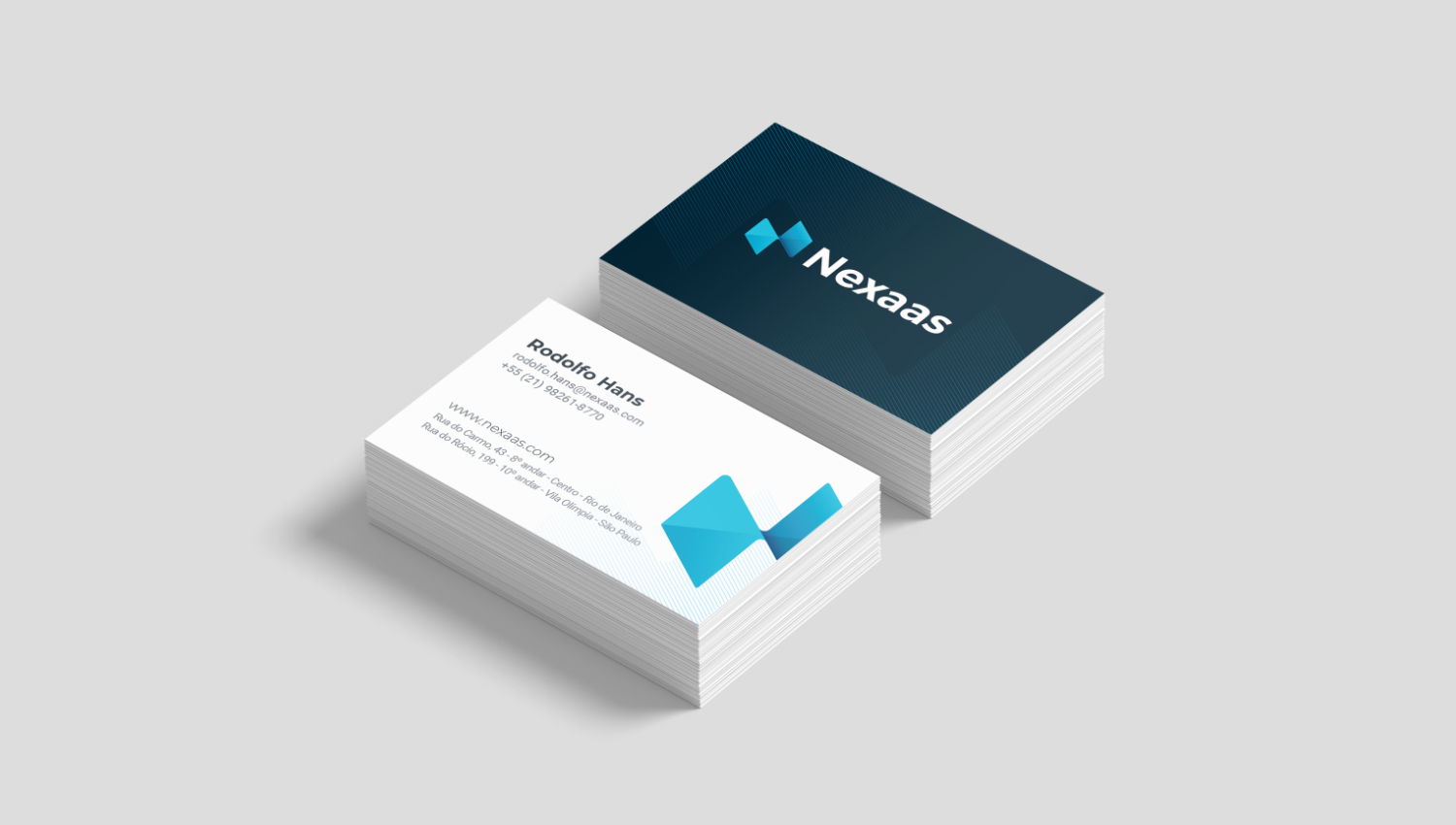
Two bussiness card stacks.